
SVA logo...
Kind of cheesy... My first shot at it... Not too sure about the helmet. Considering I did it with a track pad on a note book, not too bad. ;)
It's a good start! Needs a bit more...color, a bit-o-blood on da blade, just one, nuttin too frilly, and maybe a real skull, with a bit of a grin,....Better than I could ever do!
Big Fun,..Unreal,..Spam Viking Addicted?..BigTime!!
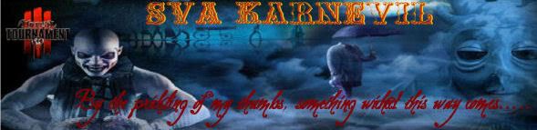
Like the font. Not sure about the axes, perhaps if they were more "hefty" the handles look pretty slim and should be "beefier".
A variation you can try:
If you could use the letter "V" in the same font, color it a bit darker than the S and A, maybe some blood and put some ax blades on the V character and have the "V" bigger in width and height than the other 2 letters and placed slightly lower than the S and A and extend the "V" so its a bit higher than the S and A character with the ax blades attached to them.
-
DW_e_aLpHa
- DW Clan Member
- Posts: 733
- Joined: Sun Apr 02, 2006 11:00 pm
- what is all this Strange need for blood -

Hello Pot, this is Kettle!e_aLpHa wrote:- what is all this Strange need for blood -
Try number 2...

It's way too good to be called number two! Lets say it's a revision. LOL The ONLY thing I'd like to see different is the font and blades, a little beefier, and more blood,...other than for that It's perfect man, just perfect! The font itself is great just looks a little thin. I like the "V" a lot better, but the mask was kind cool on the old one, why'd ya drop it? And the blades are very nice, but I'm hungry, and once again where the blade meets the handle,...it's too thin. Blood is a good thing, I try to spread as much as I can, be it others, or my own, and seeing how we play the DW's,....needs more blood! Still three cheers for zeus !! That looks great! :cheers: HEY, GET THE DUDE A BEER! Did I mention the blood thing,...oh yea, O.K., jez checkin'. As you can see too much coffee,...laters!
Big Fun,..Unreal,..Spam Viking Addicted?..BigTime!!
-
Zax_Gentoo_Box
- 1337 Haxor
- Posts: 497
- Joined: Sun Jun 18, 2006 11:00 pm
- Location: Caves of ice, Xanadu
I think it looks great, Zeus. No further revision required, if I do say so myself.
-
DW_e_aLpHa
- DW Clan Member
- Posts: 733
- Joined: Sun Apr 02, 2006 11:00 pm
- A background Image and It'll be great , mm for Spam Viking Adicts that is .. Perhaps MMA> Will be more suitable now for most SVA> , since It is the new' addiction - It'll make more sense .